A behind the scenes look at our brand update
After two years of success and growth at Hearts & Science, we found it important to revisit our brand. Just like moving into a new home, living in it for a while, and then adapting it to meet the way you find yourself living in it—taking time to step back, reflect and optimize is part of the process for building a brand too.
Below are three insights that led to some recent evolutions in the Hearts & Science brand.
Shapeshifters
Through the process of refining our corporate values, we chose to express them using collective “we” statements. Values connect our personal needs to the bigger picture of how we act and thrive in a corporate environment. One of these values stood out to us as something core to our nature. “We are shapeshifters.”
People are always changing and evolving. The fluidity in consumers means we need to listen to them and be flexible in order to stay ahead of their natural evolution. We plan, we evolve, we change and we keep pace alongside them.
This sense of constant motion is something we wanted our brand to communicate, not just through words, but at the very core. We incorporated this movement into transitions across the website.

Shapeshifting across the homepage of Hearts & Science
Duality
Consumers are unique, and they are more than one thing. Complexity allows for personalization to occur; the ability to create real, lasting relationships that are meaningful, respectful and unique.
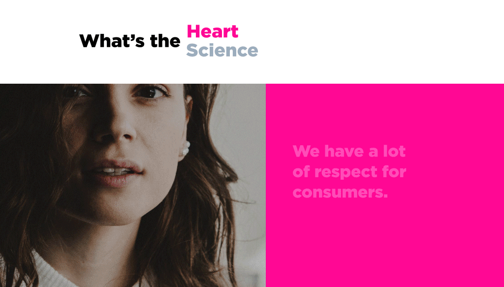
As a company, we are data-led, but data is only one part of the picture. Hearts & Science was named to reflect the duality of who we are and how we approach our unique, innovative solutions for consumers. We also believe in both local and global leadership. This duality is represented by contrast—black and white, seemingly opposing words and micro-interactions.
A toggle between our heart and science appears in a few places across the website; a chance for viewers to see both sides of who we are.
Contrasting fonts and meanings in bold typography art and heading pairings also enhance this meaning of duality. Subtle interactions across employee bios and office locations add an additional layer of meaning.
Toggle between Hearts & Science on the About page
Contrasting typography art on Services page
Shifting city interactions on Contact page
Ampersand
The & symbol was once the 27th letter of the alphabet, helping to communicate “et” (etcetera). Developed in medieval Roman times in the first century, it remained in the alphabet even after Old English was replaced by modern English. It became known as ampersand when children reciting their alphabets would say “and” last—which was awkward. Eventually, through the slurred voices of students, “and per se and” became ampersand.
Ampersand is a design element that communicates the idea of the possibility to be anything. The use of “and” is used to think further or to include space for other ideas. This, to us, also represents “fluidity” and “contrast.” It’s a great subtle communicator that ties both shapeshifting and duality into one symbol. Look for the subtle uses of the ampersand in our branding beyond the logo.
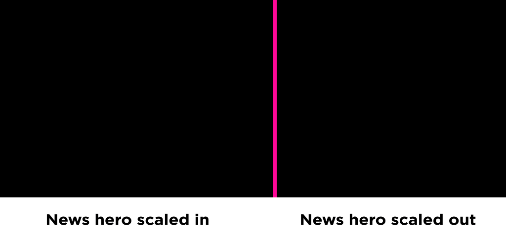
Shifting ampersands on news page
At Hearts & Science, we are the embodiment of “and” with duality and shapeshifting. We wear many hats and move fluidly from strategy to execution to planning to buying and optimizing.
We’re excited to show the world our new brand and are confident it will grow with us as we continue to innovate and lead the industry for our clients.


